This article was originally published in September 2019 and was last updated in June 2020.
As competition amongst office properties heats up, commercial landlords and leasing brokers have become more sophisticated in terms of the marketing materials they are using to promote their assets. Property websites have become a requisite feature for marketing campaigns promoting new office developments, major redevelopment, and existing campus opportunities. At AQUILA we believe that while not every property needs a website, most properties that fit into any of the categories above usually do.
Read Next: The Ultimate Guide to Commercial Real Estate Marketing
While looking for inspiration for our own property sites, our marketing team came across a lot of impressive commercial property websites and decided to share our favorites with you. In the list below, I will share my favorite aspects of each website, but I encourage you to explore them even more – I couldn’t fit everything we loved about these into one article!
Here are 10 of our favorite commercial office property websites:
1. Hudson Yards New York
Website: https://www.hudsonyardsnewyork.com/
Location: New York, New York
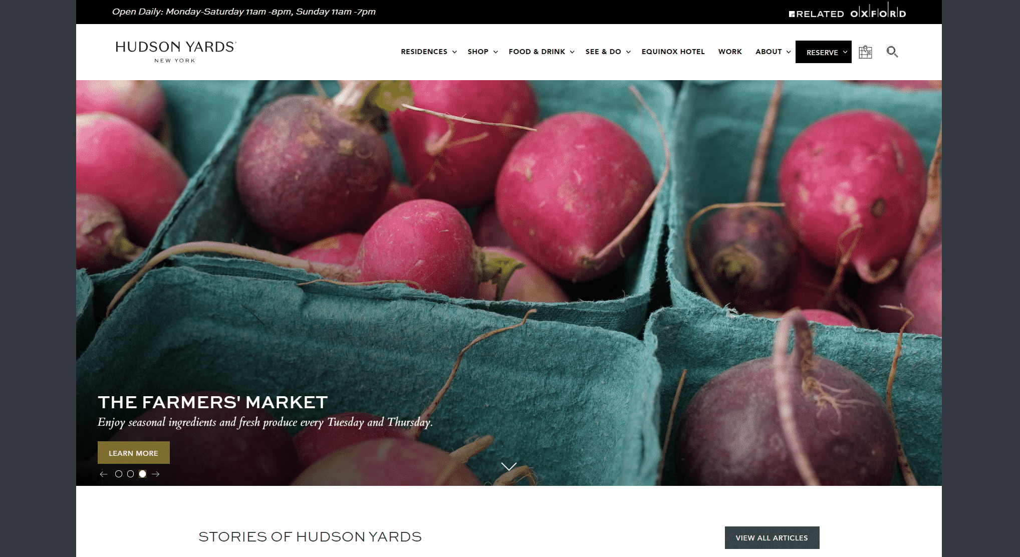
Hudson Yards is a mixed-use development located on Manhattan’s West Side which features retail, office space, and residential. It is the largest private real-estate development in the U.S. Hudson Yards made the list because it is user-friendly and it has beautiful imagery and robust content which truly tells the story of the property.
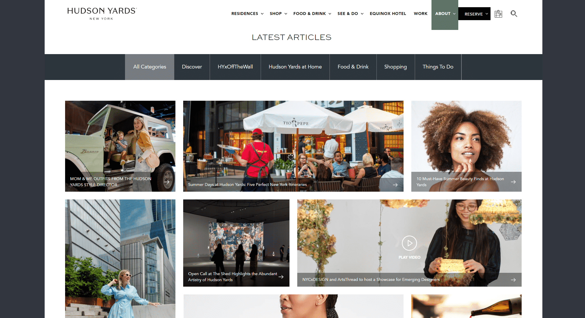
One compelling feature is the site’s “Stories of Hudson Yards” page. This page features both stories of people experiencing the development and spotlights the people who are helping the neighborhood flourish. For example, they spotlight a local chef in one story and mention how he is focused on providing “service for a neighborhood that demands it.”
Another aspect that makes the website stand out is the videos on the “Stories of Hudson Yards” page. In a lot of these videos, they highlight the project’s Instagram-worthy staircase – setting it apart from other developments. A few notable examples of these videos include a music video by The Chainsmokers that features the iconic staircase and a video from an event at one of the grand openings within the development.
The only thing that we would change would be to make the leasing inquiries easier to find. They currently have the call to action in small font at the very bottom of their website, which could be difficult for tenant rep brokers or potential users to find.
2. Eastline
Website: http://www.eastline.org/
Location: Oakland, California
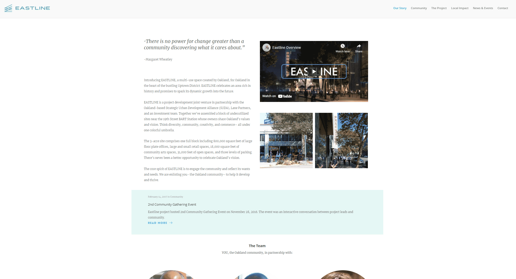
Eastline is a mixed-use development located in Oakland that features office and community arts space. Eastline made the list because of its use of history and the local community to tell the story of the property. It also features user-friendly navigation to find all of the important information.
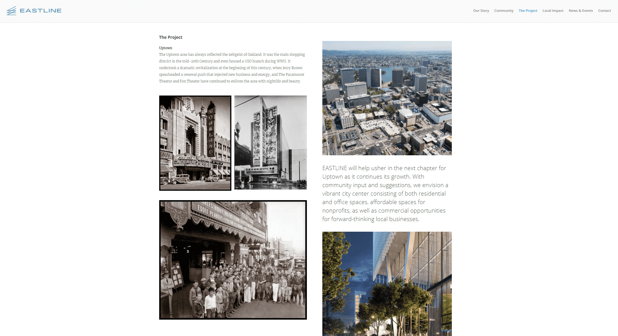
Eastline sets itself apart by highlighting the history of Oakland’s Uptown neighborhood. Only one page focuses on the building itself. Called “The Project,” this page pays homage to the history of the area with photos from the past next to images of the new development. This continues the connection to the community and shows how the project will revitalize the area.
Another compelling aspect is its page dedicated to the community. The “Community” page focuses on how the local community impacted the project. It highlights community meetings with Oakland residents, stakeholder meetings with local groups, and Eastline’s commitment to diversity and uniqueness. The “Local Impact” page shows how the project will drastically increase tax revenue and employment opportunities and also highlights its commitment to small local businesses.
3. Uptown Station
Website: https://uptownstationoakland.com/
Website Designer: Allis
Location: Oakland, California
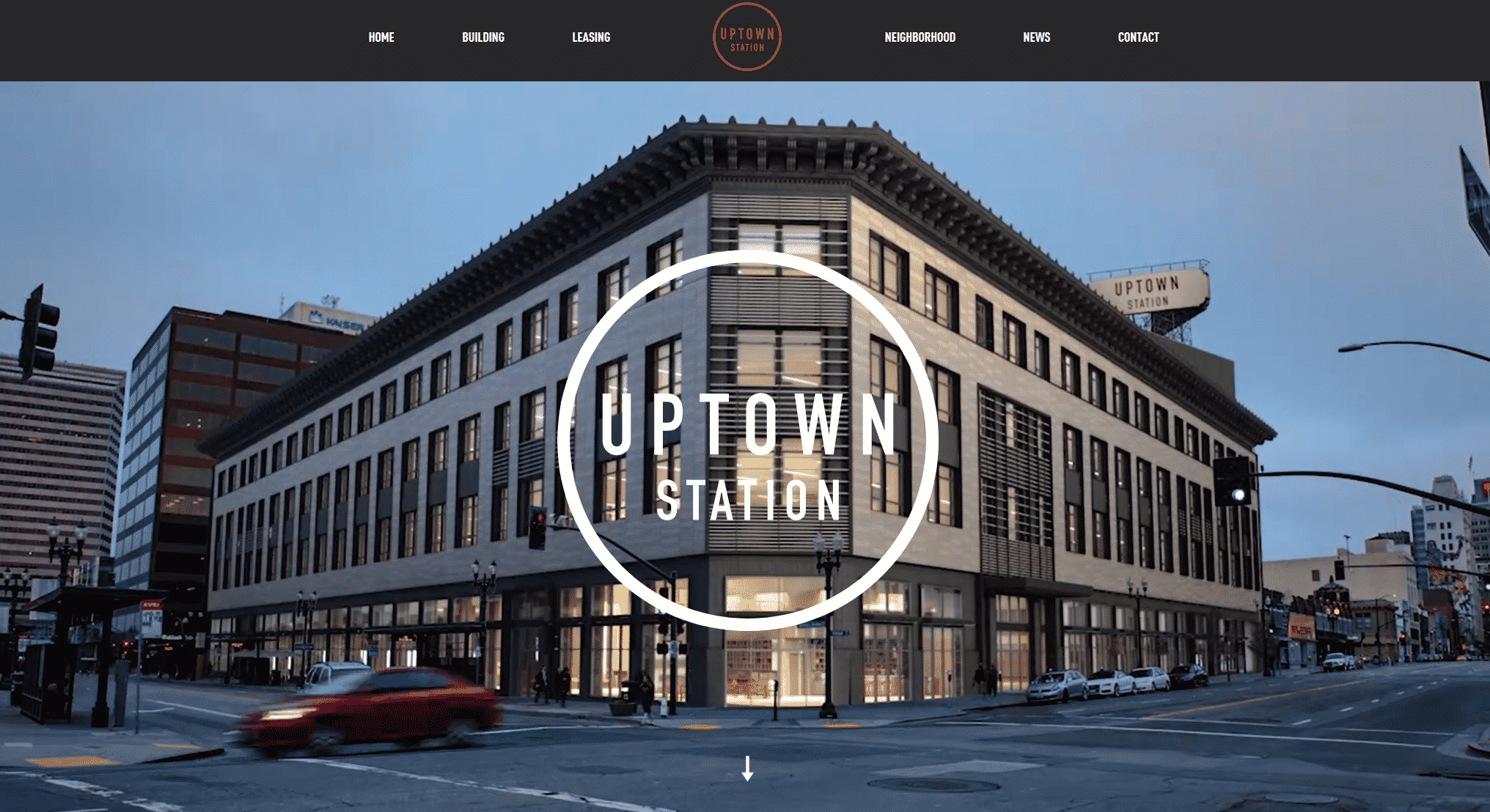
Uptown Station is a mixed-use development with office and retail space. This property was also featured in our article 10 Best Examples of Commercial Real Estate Video Marketing and is well-deserving of a place on this list as well. Uptown Station earned a spot on this list because of its use of vivid imagery and consistent styling.
I love the homepage of this website. At the top is a hero image with a looped background video featuring views of the project and a prominent call to action to watch the video (the user’s cursor will actually change from a mouse to a CTA to “View Film”). This video is the first content you see for a reason. The video gives the user a glimpse into the entire story of the property – from beginning to end.
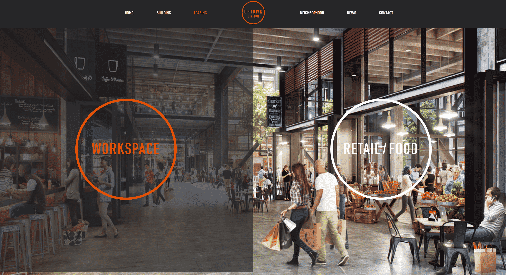
Another impressive aspect is the “Leasing” page. This page seamlessly guides the user to a specific page with information about the type of space they are looking for. This includes floorplans, a photo gallery, and a brochure. By giving the user an effortless journey to the leasing pages, the user is more likely to spend time on the page that is full of important calls to action.
4. 7700 Parmer
Website: https://7700parmer.com/
Website Designer: SpaceCraft
Location: Austin, Texas
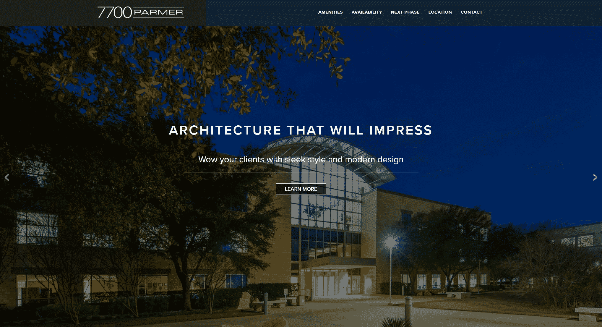
7700 Parmer is a 1,299-acre campus development located in Austin, Texas. It is home to notable brands such as eBay, PayPal, EA, Oracle, and Dunn & Bradstreet. 7700 Parmer’s website made the list because of its clean design, user-friendly navigation, and focus on highlighting its strengths. This is one of our own websites that we wanted to showcase.
Admittedly one of our own marketing assignments, but we are proud of the seamless navigation and clean layout of this website. By not flooding the pages with information, the user can easily find what they are looking for without wading through unnecessary content. This makes it easier for the user to read the website and find CTAs.
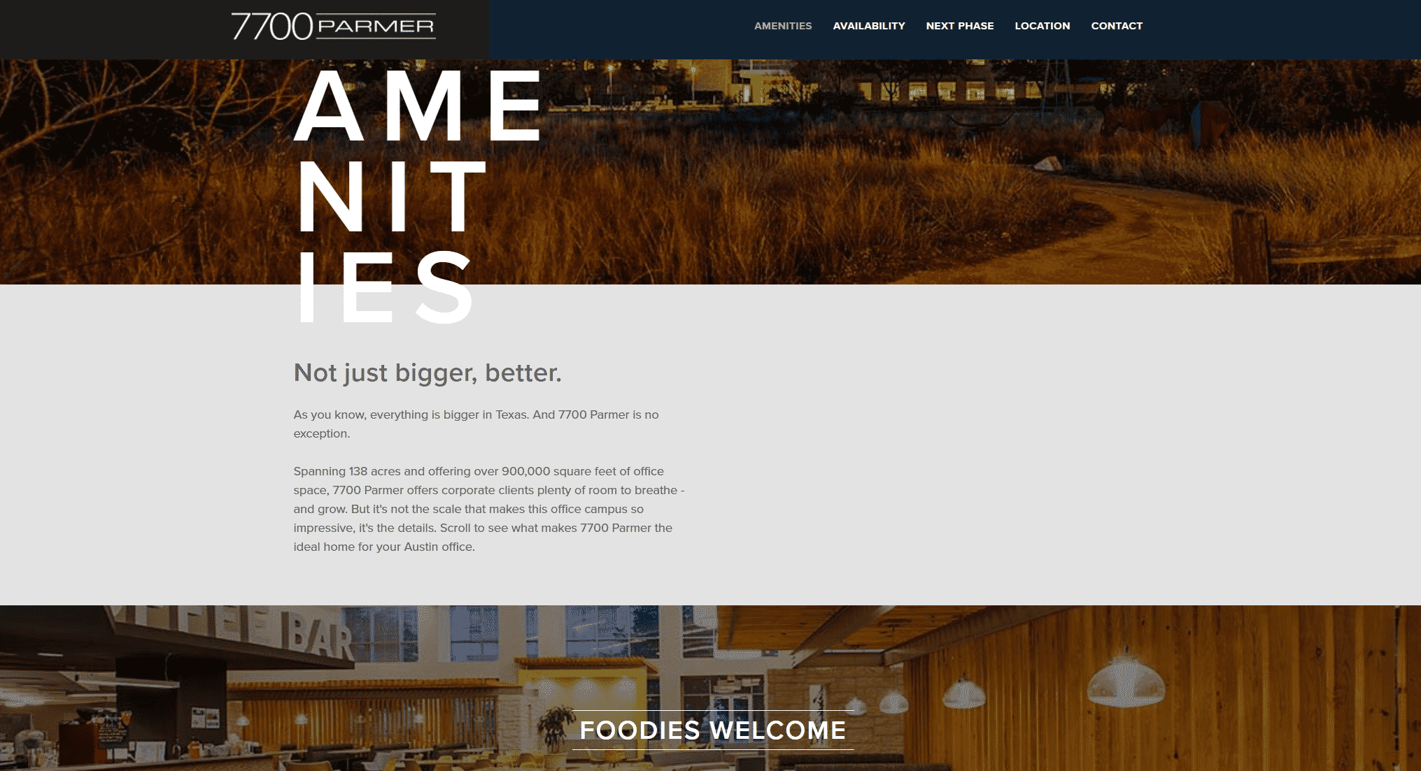
This website also maintains a focus on the high-value aspects of the property. For example, the amenities tab showcases all of the amenities that set it apart from other properties – adding tremendous value. The property presents a campus atmosphere for tenants, offering a large cafe, extensive fitness, and sports facilities, on-site childcare, and more, which allows its large tenants to offer their employees the same benefits as their West Coast campuses without having to build their own office parks in Austin.
5. MetCenter
Location: Austin, Texas
Website: http://www.metcenter.com
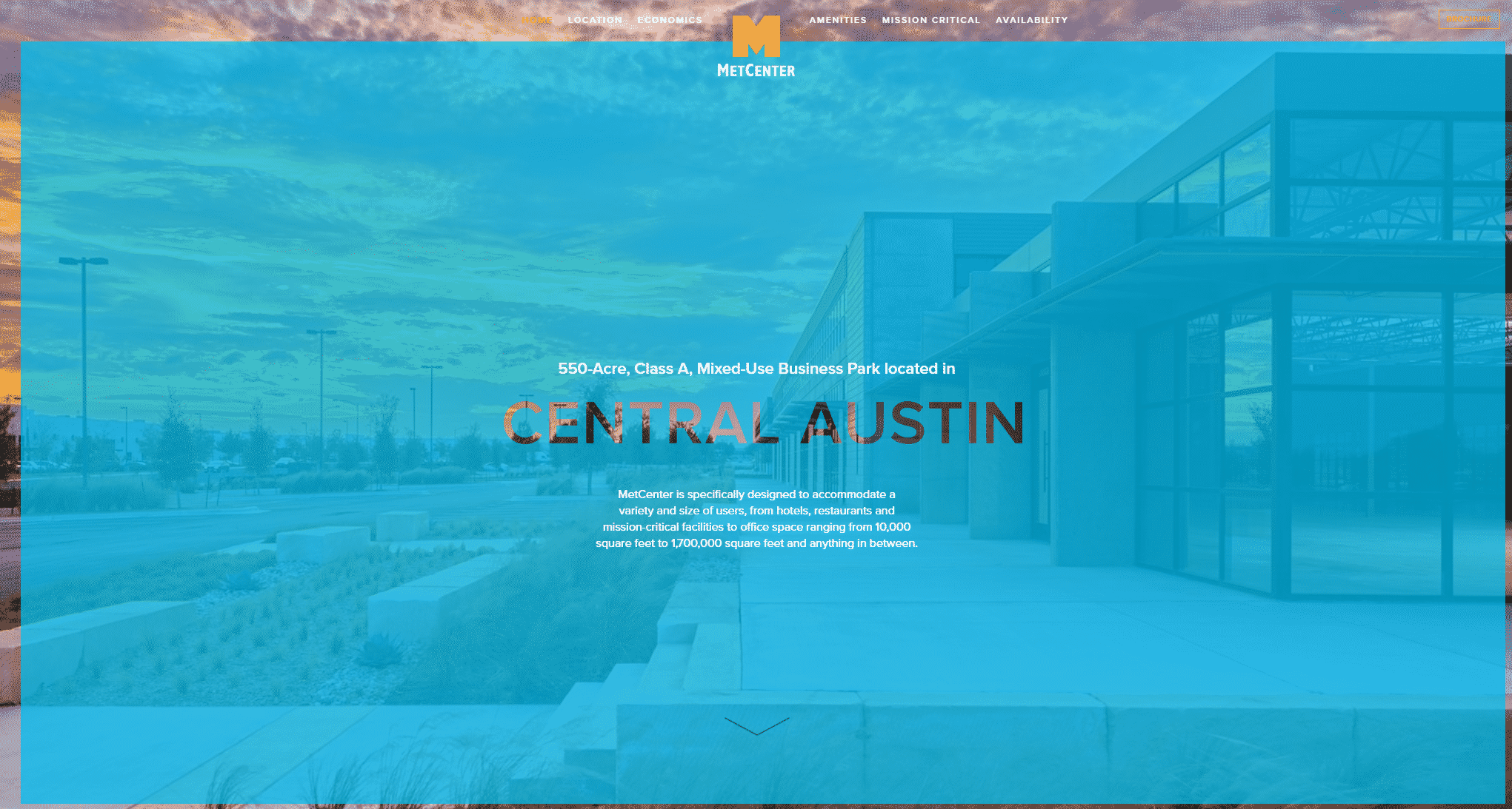
MetCenter is a large mixed-use business park offering both flex and office space in Austin, Texas. MetCenter made the list because of its interactive aspects and user-focused content.
One of the most unique aspects of this website is the “Economics” page. This page shows how the property is the most cost-effective choice for tenants. They include infographics that highlight the most important information to prospective tenants – cost. The site highlights the high parking ratio, low operating expenses, and overall savings compared to traditional real estate property costs in Austin.
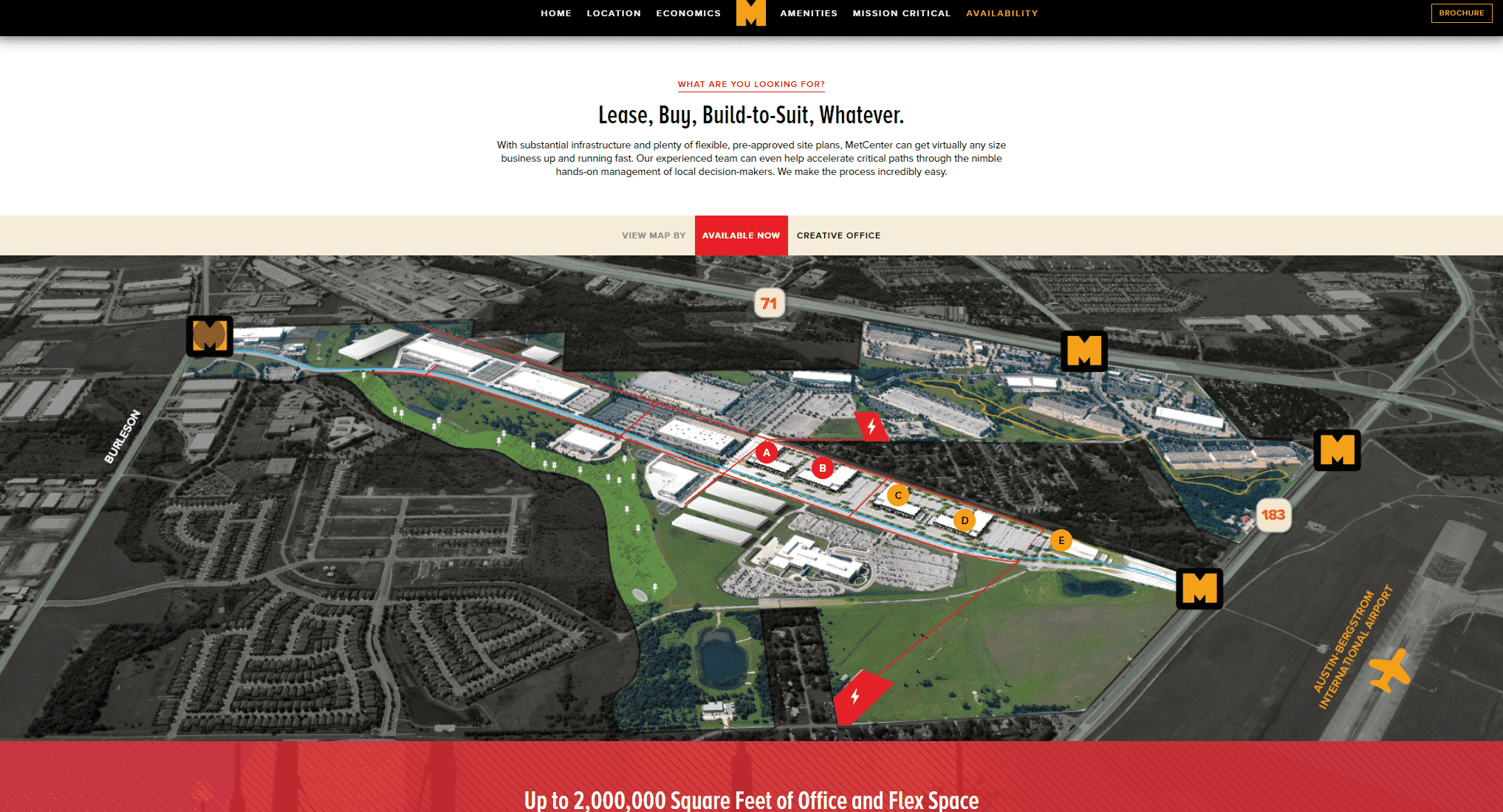
This website sets itself apart with an interactive map that shows where certain types of buildings are located in the development. This is helpful for prospective tenants looking for specific types of space for their businesses. On the “Amenities” page, another map features all of the amenities in the business park that typical flex or value office properties are often lacking. These include restaurants, hiking and biking trails, cafes, tennis and basketball courts, and countless other amenities available in the development.
The thing that feels missing from this site is an additional video. This site currently has video renderings but additional footage of the actual property or lifestyle videos could improve the site.
6. Avery Centre
Website: https://www.averycentreroundrock.com/
Website Designer: Designed using Wix
Location: Round Rock, Texas
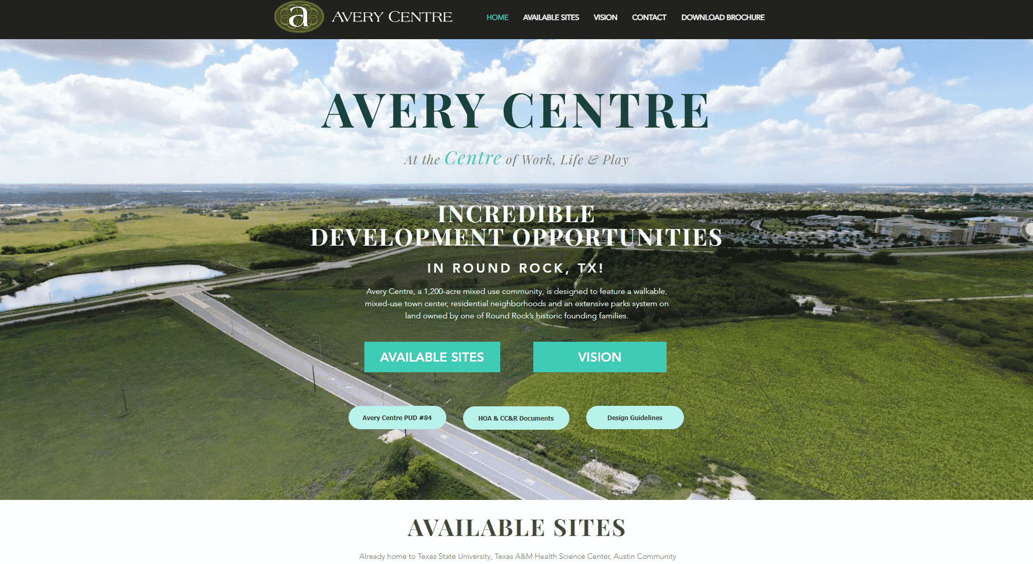
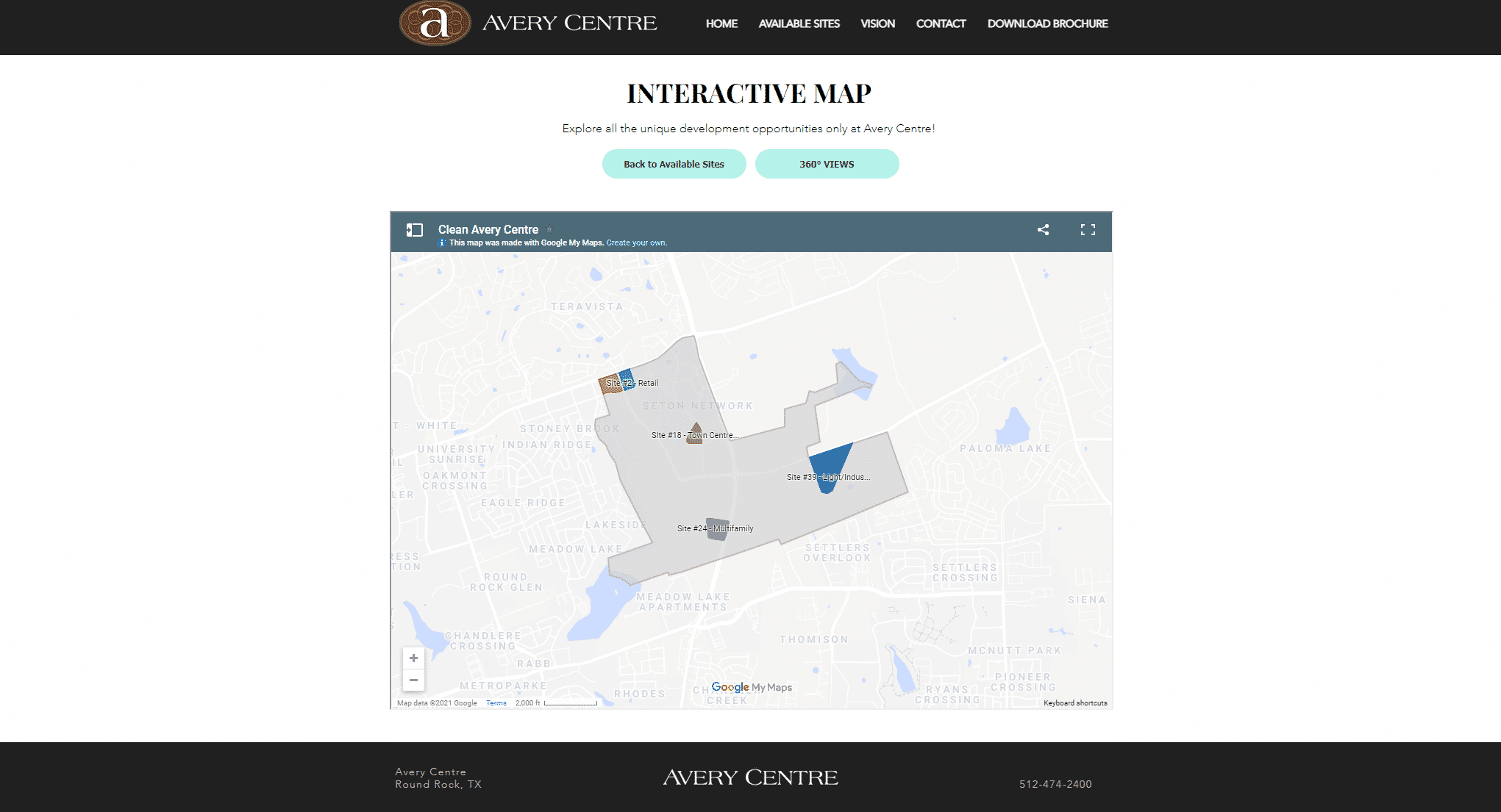
Avery Centre is a 1,200-acre mixed-use community development located in Round Rock, Texas. Avery Centre made the list because of its content, user-friendly navigation, and interactive elements.
I particularly love the “Vision” section of the homepage, where it provides links to all the most important information about the development – highlighting the master plan and proposed Town Center, completed and under-construction projects in the development, surrounding employers, and more. By grouping these in one place, users have an easier time finding what they want to know.
7. Westview
Website: http://westviewaustin.com/
Location: Austin, Texas
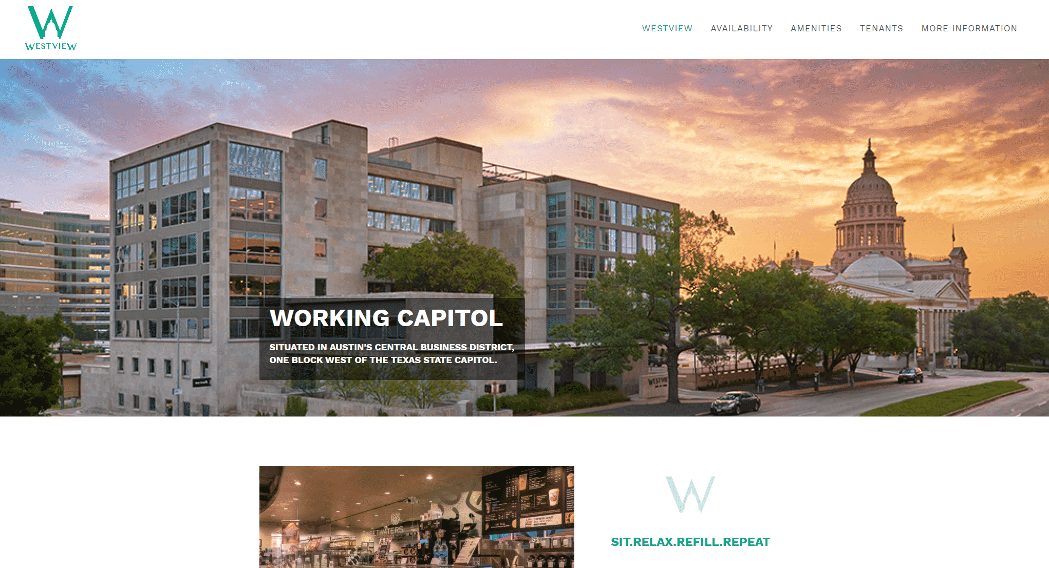
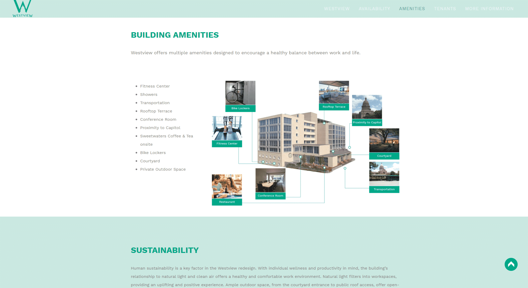
Westview is an office redevelopment and expansion located in Austin, Texas. Westview made the list because of its focus on location, simple design, and compelling imagery.
I love this website’s use of vibrant imagery. On the homepage, the sunset above the capitol draws the eye to the menu bar as well as the CTA to download the brochure. As you scroll down the rest of the homepage, you are greeted with more lifestyle images showing people working in an office and drinking coffee. By adding people to their images (instead of just images of the building) they are adding a human element to the property.
8. RiverSouth
Website: http://www.riversouthaustin.com/
Location: Austin, Texas
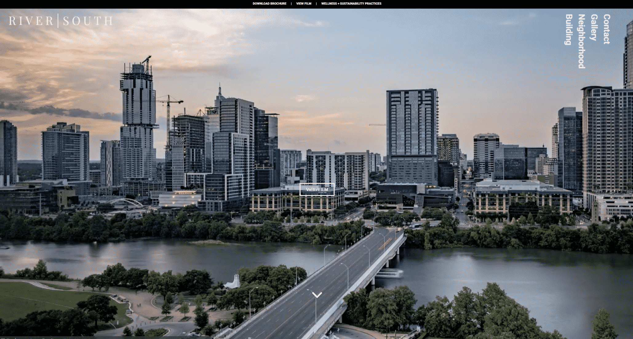
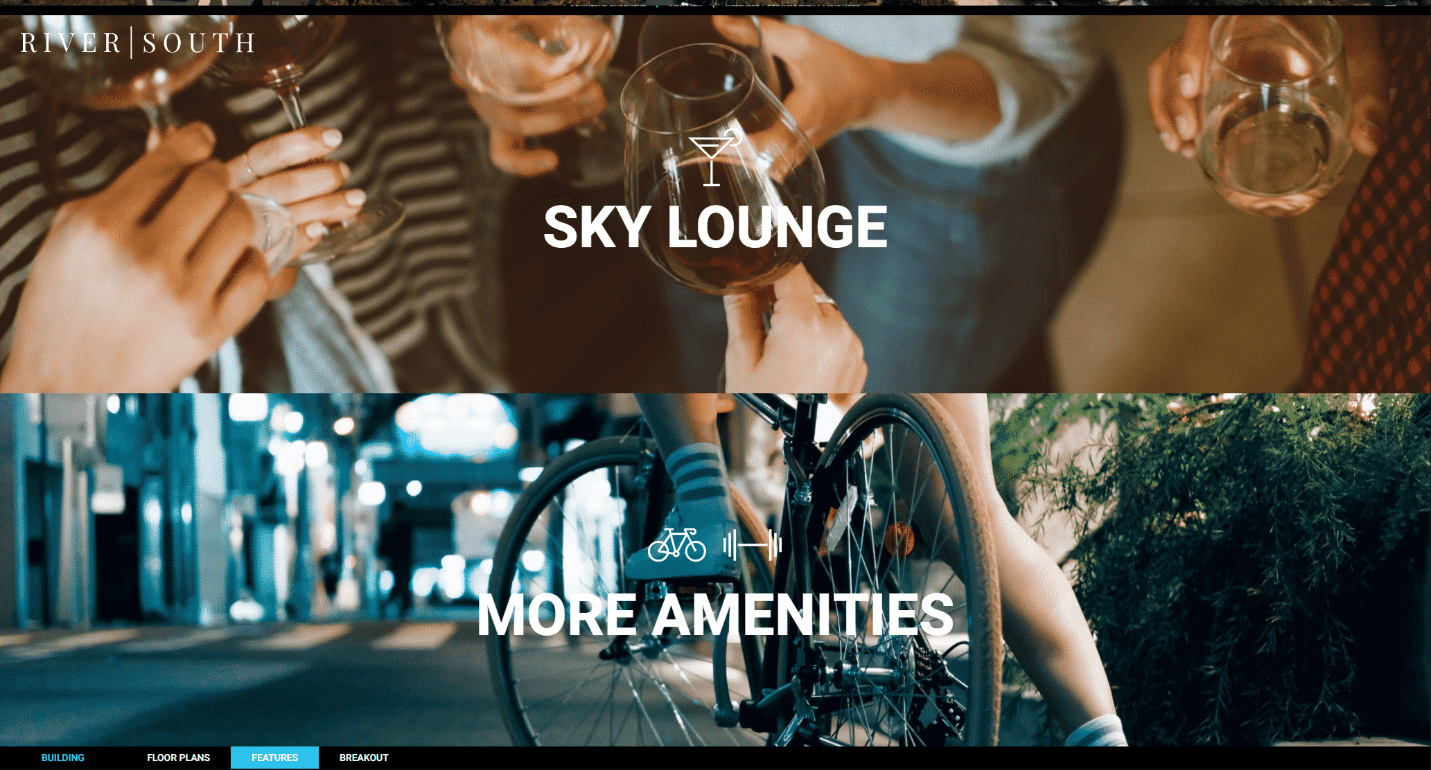
RiverSouth is an office development featuring ground-floor retail and restaurants just south of downtown Austin. RiverSouth made the list because of its compelling imagery and clear CTAs.
This website very effectively puts its CTA at the top of the user’s mind. This website keeps all of the content on the homepage and the CTAs remain at the top of the page the entire time. These CTAs include a link to download the brochure and view their film.
Another unique element is its diagram of the building which highlights the most important aspects for prospective tenants. This includes amenities such as a fitness studio with locker rooms, restaurants and retail, and a sky lounge. The diagram shows where each amenity is located in the building and gives a brief description.
The only critique I have of this is the one-page design. Keeping everything on one page can be confusing to users and limits the amount of information you can deliver to them. It also makes it difficult to share parts of the page with a colleague since you don’t have individual links to specific places you can send colleagues to.
9. Red Hoek Point
Website: http://redhoekpoint.com/
Website Designer: Conway + Partners
Location: Brooklyn, New York
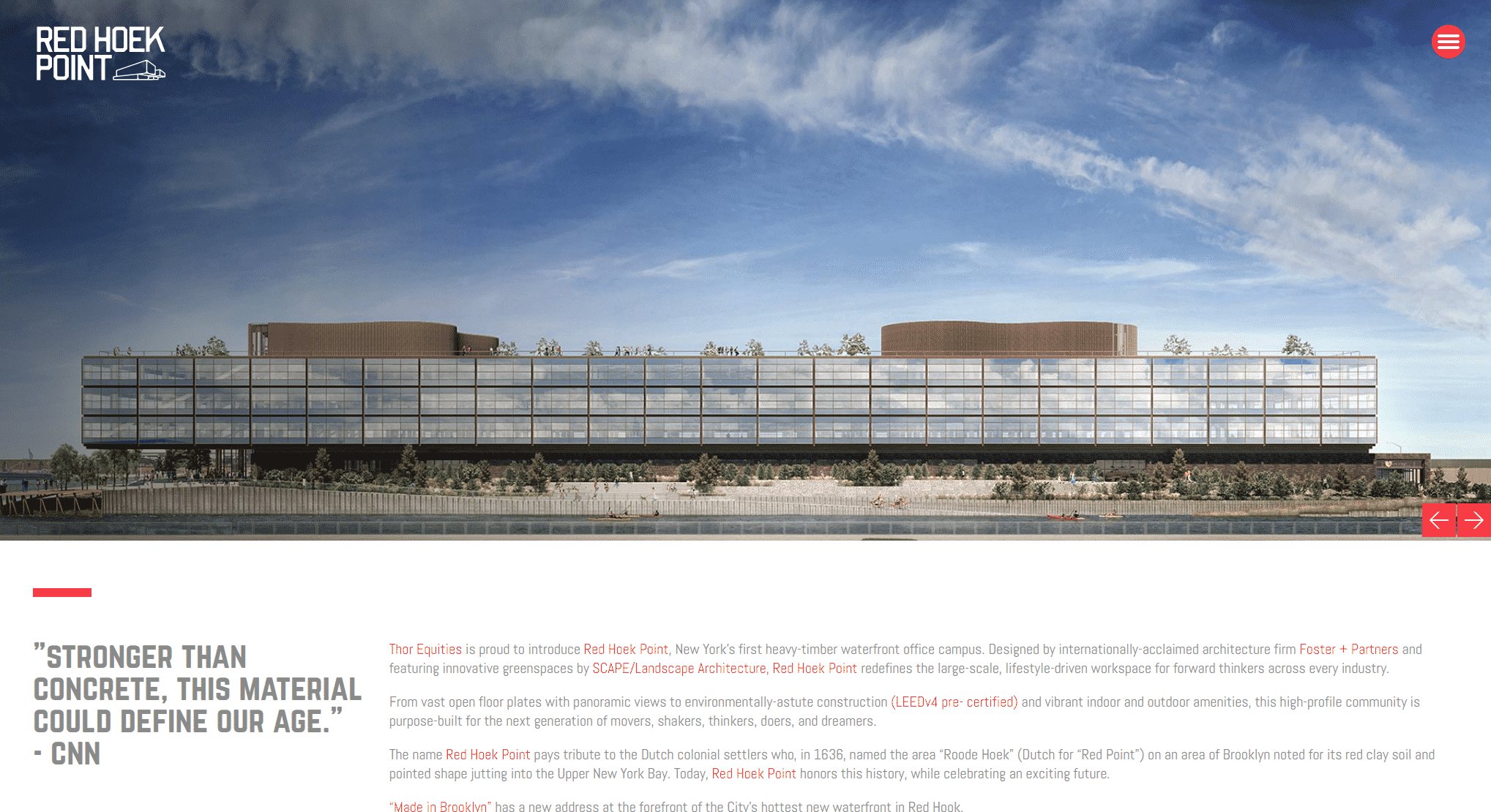
Red Hoek Point is a waterfront office campus development located in Brooklyn, New York. Red Hoek Point made the list because of its creative animations and vibrant imagery related to its location.
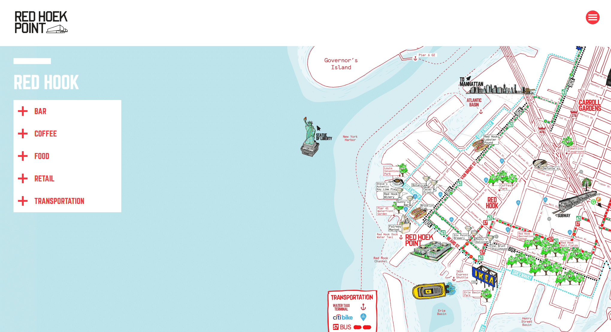
My favorite aspect of this website is the animated map that shows the location of the building in relation to popular spots around town as well as transportation. This adds character to the site while also demonstrating the value of the building’s location.
I also love the imagery that highlights the project’s location. The website opens with an animated rendering of the property that features a flowing waterfront and drifting sky. Much of the copy on their website focuses on this waterfront advantage and the location of the building. This copy is easy to read and stands out against the images on the page.
10. CityLine
Website: https://citylinedfw.com/
Website Designer: Matchbox Studio
Location: Dallas, Texas
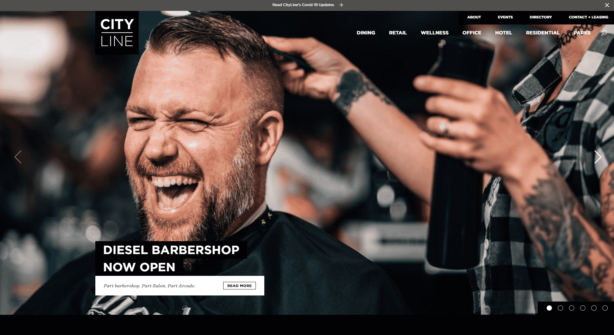
CityLine is a vibrant mixed-use development located in Dallas, Texas. CityLine is a great example of a website that speaks to multiple audiences: office and retail tenants, residents, shoppers, diners, and visitors.
My favorite aspect of this website is the page dedicated to events in the CityLine development. This shows that the development is alive and attracts a large audience. I also like that they have a page dedicated to the surrounding parks and trails – an important amenity to anyone living in a city.
The imagery on the website is also captivating. It includes pictures of delicious food, open outdoor areas, and more. This is what initially caught my attention when I first opened the website.
Conclusion
Through our search, we found countless websites that impressed us, but unfortunately, we couldn’t fit them all in this post.
We hope this inspired you to go above and beyond when designing your property websites. As you can see, a good website can make all the difference to a user.
For more property marketing inspiration and education, visit the Marketing Your Commercial Property section of the AQUILA Learning Center.
.


